A short introduction to density plots
Press play or scroll up and down to move through video


8k $102k $0k $50k $136k $10k $21k $0k $63k $50k $51k $28k $39k $10k $100k $80k $14k $23k $74k $25k $0k $25k $10k $40k $0k $42k $60k $27k $39k $20k $6k $0k $11k $13k $62k $16k $10k $5k $53k $76k $5k $13k $0k $13k $40k $23k $28k $14k $12k $30k $130k $34k $25k $23k $35k $15k $62k $75k $12k $35k $0k $12k $35k $32k $0k $30k $43k $24k $0k $54k $40k $38k $0k $44k $0k $60k $40k $30k $18k $37k $24k $0k $10k $38k $22k $5k $9k $95k $230k $108k $0k $32k $12k $86k $0k $2k $10k $40k $132k $2k $40k $93k $57k $35k $28k $25k $40k $12k $15k $75k $20k $37k $18k $40k $6k $100k $35k $7k $38k $1k $31k $65k $50k $60k $12k $23k $2k $20k $21k $22k $13k $0k $5k $29k $65k $10k $45k $25k $13k $10k $46k $25k $0k $35k $58k $28k $99k $0k $18k $50k $32k $32k $0k $27k $0k $12k $105k $15k $65k $45k $47k $0k $45k $28k $161k $36k $36k $30k $5k $25k $80k $20k $15k $0k $4k $0k $23k $33k $13k $27k $88k $38k $12k $24k $33k $13k $9k $98k $18k $0k $14k $3k $15k $16k $6k $20k $46k $5k $0k $24k $21k $9k $0k $46k $33k $19k $7k $18k $7k $60k $45k $4k $22k $0k $20k $30k $3k $6k $40k $59k $45k $100k $44k $1k $35k $25k $21k $33k $0k $14k $36k $0k $90k $15k $70k $92k $15k $1k $36k $6k $6k $35k $51k $0k $25k $0k $12k $6k $80k $54k $48k $0k $25k $41k $22k $23k $11k $38k $5k $23k $35k $12k $54k $102k $18k $5k $8k $0k $13k $32k $2k $25k $18k $27k $31k $80k $8k $17k $0k $22k $0k $45k $80k $30k $15k $32k $13k $33k $9k $31k $35k $28k $32k $8k $40k $80k $60k $30k $24k $28k $67k $35k $35k $26k $10k $18k $12k $38k $165k $23k $45k $44k $34k $24k $5k $63k $67k $0k $51k $405k $10k $25k $23k $24k $0k $2k $0k $50k $101k $0k $59k $12k $35k $43k $28k $65k $0k $52k $22k $47k $38k $19k $30k $0k $12k $0k $100k $30k $18k $18k $46k $10k $15k $16k $36k $23k $0k $10k $20k $3k $2k $0k $0k $67k $0k $42k $10k $8k $28k $0k $14k $18k $0k $12k $32k $42k $41k $21k $120k $20k $18k $28k $61k $25k $52k $6k $12k $10k $0k $14k $31k $2k $22k $45k $60k $11k $27k $65k $13k $40k $0k $14k $16k $33k $7k $7k $4k $32k $20k $0k $57k $0k $0k $70k $12k $0k $82k $25k $22k $16k $36k $65k $71k $46k $13k $44k $19k $21k $33k $20k $14k $8k $100k $25k $30k $0k $34k $0k $21k $62k $0k $10k $45k $80k $2k $75k $13k $0k $60k $30k $50k $3k $25k $79k $35k $15k $24k $10k $0k $0k $35k $14k $2k $30k $0k $56k $9k $37k $20k $31k $7k $36k $0k $150k $25k $15k $20k $13k $21k $17k $0k $16k $42k $38k $0k $22k $20k $15k $0k $11k $33k $23k $9k $20k $0k $60k $34k $8k $0k $74k $16k $0k $9k $100k $0k $12k $45k $0k $0k $34k $22k $10k $36k $0k $9k $18k $1k $8k $20k $13k $30k $0k $18k $47k $14k $13k $30k $20k $70k $53k $8k $8k $31k $30k $1k $42k $0k $0k $21k $30k $52k $18k $33k $44k $0k $22k $0k $33k $10k $268k $2k $0k $28k $20k $42k $62k $14k $60k $25k $18k $92k $108k $51k $41k $0k $12k $30k $45k $2k $21k $0k $35k $0k $1k $40k $0k $75k $24k $2k $12k $50k $29k $1k $27k $0k $16k $0k $30k $1k $20k $0k $19k $127k $65k $42k $23k $50k $8k $31k $35k $66k $0k $22k $70k $45k $19k $14k $130k $20k $45k $87k $8k $36k $30k $49k $47k $25k $0k $30k $25k $26k $37k $8k $0k $27k $72k $35k $16k $0k $21k $13k $74k $0k $16k $40k $63k $23k $19k $6k $38k $2k $16k $0k $90k $5k $0k $14k $0k $45k $14k $31k $0k $14k $17k $81k $204k $5k $35k $14k $18k $137k $39k $3k $52k $13k $2k $40k $37k $5k $24k $1k $4k $40k $30k $10k $35k $15k $106k $7k $45k $20k $20k $0k $15k $26k $0k $65k $3k $16k $25k $40k $40k $9k $12k $40k $30k $38k $0k $28k $17k $28k $47k $94k $0k $0k $14k $0k $15k $0k $25k $47k $0k $40k $5k $36k $49k $35k $43k $14k $32k $30k $0k $0k $0k $5k $50k $16k $18k $50k $20k $1k $1k $0k $9k $40k $71k $19k $15k $15k $70k $0k $1k $6k $8k $52k $21k $17k $11k $12k $25k $42k $8k $24k $36k $65k $0k $35k $20k $6k $0k $30k $65k $51k $12k $75k $38k $7k $22k $34k $9k $17k $1,000k $21k $32k $4k $72k $36k $106k $2k $2k $1k $50k $19k $38k $0k $93k $18k $22k $9k $5k $52k $86k $13k $71k $0k $75k $0k $32k $25k $16k $0k $48k $16k $18k $85k $0k $0k $0k $50k $30k $15k $40k $44k $52k $28k $0k $74k $49k $8k $38k $20k $17k $8k $42k $52k $18k $25k $80k $1k $32k $11k $15k $17k $23k $37k $0k $17k $0k $50k $14k $0k $15k $2k $11k $43k $0k $53k $12k $16k $10k $41k $33k $45k $24k $30k $20k $10k $22k $30k $21k $43k $35k $12k $65k $15k $21k $27k $25k $20k $30k $20k $4k $42k $2k $1k $63k $32k $0k $0k $26k $57k $0k $18k $10k $0k $50k $9k $0k $0k $40k $4k $60k $52k $6k $14k $0k $0k $51k $0k $52k $8k $67k $44k $11k $11k $48k $24k $0k $6k $121k $20k $35k $2k $33k $0k $20k $56k $15k $80k $17k $2k $126k $15k $55k $0k $0k $0k $87k $14k $40k $30k $12k $57k $25k $0k $7k $0k $12k $16k $14k $30k $42k $0k $22k $0k $20k $60k $7k $3k $16k $9k $100k $0k $0k $7k $15k $32k $7k $53k $0k $34k $89k $10k $10k $40k $13k $0k $15k $10k $25k $73k $62k $0k $10k $26k $44k $26k $30k $42k $120k $0k $14k $42k $110k $85k $5k $15k $0k $111k $6k $32k $10k $1k $2k $24k $15k $30k $56k $0k
Distributions
Who made more at age 25, millenials or baby boomers?


Initial approach: Compare summary statistics
25 year-old boomers
$40k
$50k$0k
$42k
$50k$0k
$10k
$50k
$13k
$50k
$27k
$50k
$40k
$42k
$10k
$13k
$27k
25 year-old millennials
$80k
$50k
$100k
$13k
$50k
$40k
$32k
$50k
$40k
$16k
$50k
$40k
$0k
$50k
$40k
$80k
$13k
$32k
$16k
$0k
Median: $50k Mean: $26.4k Mean: $50k < > = Mean: $28.2k Mean: $50k Mean: $52k Median: $50k Median: $40k
mean(x) = ∑x⁄n
$ $ $ $ $ $ $ $ $ $
$ $ $ $ $ $ $ $ $ $ $ $ $ $ $ $
Median ≈ 50th percentile
$10k
$20k
$40k
$80k
$100k
Half the data Median Half the data
Trimean, Winsorized mean, Geometric median, Interquartile mean, Midrange, Truncated mean, Weighted arithmetic mean, Mode, Geometric mean, Tukey median, Midhinge, Harmonic mean, Root mean square, Simplicial depth, Winsorized mean, Trimean, Geometric median, Interquartile mean, Midrange, Truncated mean, Weighted arithmetic mean, Mode, Geometric mean, Tukey median, Midhinge, Harmonic mean, Root mean square, Simplicial depth, Trimean, Winsorized mean, Geometric median, Interquartile mean, Midrange, Truncated mean, Weighted arithmetic mean, Mode, Geometric mean, Tukey median, Midhinge, Harmonic mean, Root mean square, Trimean, Winsorized mean, Geometric median, Interquartile mean, Midrange, Truncated mean, Weighted arithmetic mean, Mode, Geometric mean, Tukey median, Midhinge, Harmonic mean, Root mean square, Simplicial depth, Winsorized mean,

Correction: The CPS ASEC is conducted yearly
*CPS ASEC is conducted yearly
Boomers
Millennials
Area = 0.0000135 × 50,000 × 0.5 ≈ 0.34
Percentiles
Are giant sequoias taller than redwoods?
Are homes in San Diego more expensive than homes in Boston?
And do millennials earn less than baby boomers?
While these are simple questions, they can be hard to answer.
That's because there isn't one giant sequoia height,
one San Diego home price,
or one income earned by all millennials.
Rather, these questions are about spreads of many different values.
Statisticians call these spreads distributions,
and so while we can't talk about the income of all millennials,
we can talk about the distribution of millennials' incomes.
Recognizing that these questions are about distributions
makes it clear why answering them can be tough—
how do you compare groups of different values?
As an example, let's answer part of one of these questions:
Who earned more at age 25,
American millennials or American baby boomers?
Comparing millennials' finances with earlier generations
is a popular topic in the media,
although different stories don't always reach the same conclusion.
In this video, we'll see how density plots can help us
better understand this comparison, and make sense of these discrepancies.
One way to compare these groups is by finding a number—
that is, a statistic—
that summarizes both groups' incomes.
For example, we could compare the average, or mean incomes
of 25-year-old millennials and boomers,
and say the group with the higher income earns more.
However, reducing a distribution to a single number
always comes at the cost of lost information.
We'll get a simple answer,
but this answer may hide a more complicated reality.
To get a better idea of how summary statistics can be misleading,
let's take a deeper look at averages.
While averages are widely used and often useful,
they are highly influenced by extreme values.
For example, imagine that the millennial and boomer groups
we are comparing both have only these five members.
We'll also start by assuming that all incomes are identical,
with everyone in both groups earning $50,000.
In this case, of course,
the mean income of both groups will be equal.
Now, let's double the income of the highest-earning millennial,
and cut the incomes of the other four by 20% to $40,000.
This change would actually increase the
mean millennial income by 4% to $52,000.
Because the boomers' incomes didn't change,
using means would lead us to conclude that these millennials
earned more than the baby boomers.
But this seems misleading—
four of the five millennials had their incomes reduced
and now earn less than the boomers.
Instead, the increased income of the highest-earning millennial
is masking their broader decline.
You can get a better feel for the relationship
between a distribution and its average
by dragging these income values up and down to change the data.
The effect of extreme values on means is especially pronounced
when working with incomes—
while most people's incomes are relatively modest,
top earners can earn orders of magnitude more.
When working with these kinds of asymmetric distributions,
researchers often use medians to summarize data
and make comparisons.
As we'll see, unlike the mean,
the median is often unaffected by extreme values.
Let's look at how changing the income of our five millennials
affects their median income.
The median income is the point that divides the data
into two equal subgroups.
This means that about half the workers
will make more than the median, and half will make less.
When there are 5 workers in a group,
the median income will equal the income
of the third highest-earner.
Making the same changes we did earlier—
doubling the income of one millennial
and cutting the incomes of the other four by 20%—
reduces the median millennial income to $40,000.
Unlike the mean, the median isn't highly influenced
by the millennial earning $100,000.
This is because medians are robust,
or insensitive to extreme values.
While this insensitivity is often useful,
it can also be problematic and obscure important information.
For example, imagine that we set the incomes
of two baby boomers to zero.
Because the income of the
third highest-earning boomer hasn't changed,
this won't change their median income.
Just like the mean, using the median can lead us to
overlook important features of the distribution.
Extreme values are important,
even if we don't want them to dominate our analysis.
While the mean and median are the most
widely used summary statistics,
there are countless others we could investigate.
While some do a better job summarizing a distribution than others,
they are all, by definition, simplifications.
Reducing a distribution to a single number
always gives an incomplete picture.
An alternative approach to using summary statistics
is to analyze and compare distributions visually.
Done correctly, visualizations can accurately
summarize a distribution with minimal information loss.
Let's see if this approach can help us answer
our question about millennials' and boomers' incomes
using real data from the IPUMS CPS database.
The CPS, or Current Population Survey,
is an annual survey conducted by the US Census Bureau
that can be used to estimate the true income distributions of both groups.
We'll use these estimated quantities as our data for visualization.
Following the Pew Research Center,
we'll define baby boomers as those born in 1946 through 1964,
and millennials as those born in 1981 through 1996.
We'll also only look at the incomes of those
who worked full-time, year-round, at age 25,
and we'll adjust incomes for inflation
so that they're denominated in 2019 dollars.
Let's start by plotting the incomes of 25 year-old baby boomers.
To do so, we'll make a series of bins $10,000 wide,
and assign each boomer to a bin based on their annual income.
We can then plot these bins as bars, with the height of each bar
determined by the number of baby boomers in the bin.
These plots are called histograms.
Because they're easily understandable and simple to make,
they're probably the most popular way to visualize a distribution.
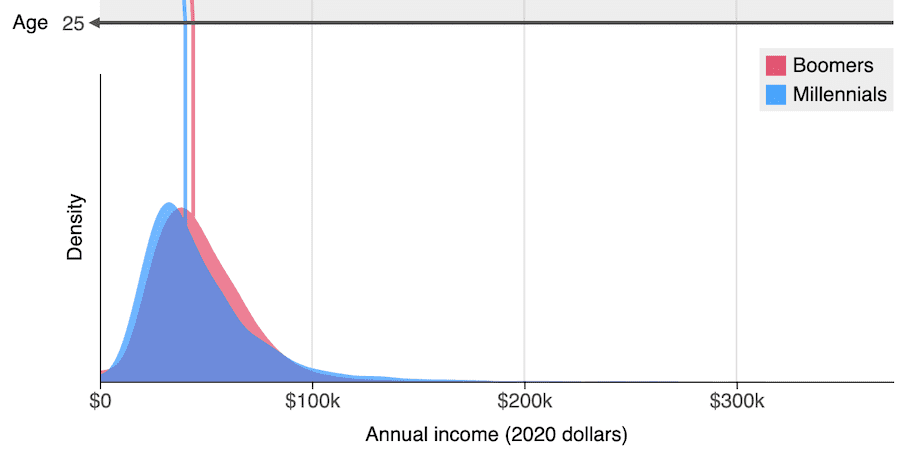
Looking at the histogram, we see that
most 25 year-old baby boomers earned between $20,000 and $70,000.
The bin with the most workers—
that is, the highest histogram bar—
is the $20,000-$30,000 bin, with about 7.6 million baby boomers.
Let's add the millennial incomes to the same figure as a
blue, slightly transparent, histogram.
We can see that the shapes of the
boomer and millennial income distributions are pretty similar.
However, it's hard to compare the distributions directly
because differences between the histograms
may reflect different numbers of workers—
is the $40,000-$50,000 bin higher for baby boomers than millennials
because a higher proportion of boomers
made between $40,000 and $50,000,
or because there were simply more baby boomers?
To address this, we can normalize the histogram
by dividing the bin heights by the number of people in that group.
Normalizing the histogram means that the total area of all the bins
for both the boomer and millennial plots will equal 1,
and the height of the bin will equal
the proportion of people in that bin.
When we do this for both groups,
we see that the $40,000 - $50,000 bar is higher for boomers,
and so a higher proportion of 25 year-old baby boomers
made between $40,000 and $50,000.
We are getting closer to answering our question
about millennial and boomer incomes.
However, the shape of a histogram is
clearly influenced by which bins we choose—
choosing bins $10,000 wide was rather arbitrary.
In general, histograms with more narrow bins
can more accurately represent the distribution.
However, narrow bins can also make histograms hard to interpret,
as many of the bins will have few, if any, observations.
These issues often lead data scientists
to visualize distributions using density plots.
You can think of a density plot as a smoothed curve
that approximates a normalized histogram with infinitely small bins.
While smoothing our histogram can give a better picture of the data,
interpreting density plots can be counterintuitive.
Instead of capturing the proportion of workers that made a certain amount,
the height of the density plot at a certain point
is determined by the proportion of workers
making incomes near that amount.
To understand what's going on, note that similar to a normalized histogram,
the area under the density curve must equal 1.
Similarly, the area under the curve between two points
will match the proportion of data between those points.
For example, imagine that we want to find the proportion of
25 year-old millennials earning between $50,000 and $100,000.
We can estimate this proportion by getting the
area of the millennial density curve between $50,000 and $100,000.
We can approximate this area with a triangle that has an area of about 0.34.
This means that roughly 34% of 25 year-old millennial workers
made between $50,000 and $100,000.
Because the area under a single point is zero, according to the density plot,
the proportion of workers making any specific income is zero.
This means that while the height of a density plot isn't easily interpretable,
it can be used for comparisons.
Because the millennial curve is higher at $30,000 than $20,000,
a higher proportion of 25 year-old millennials made about $30,000.
Similarly, because the baby boomer curve
is higher than the millennial curve at $60,000,
a higher proportion of 25 year-old boomers made about $60,000.
So, who made more:
25 year-old baby boomers or 25 year-old millennials?
Looking at the density plots of both groups' incomes,
we see that there isn't a simple answer.
While baby boomers' incomes are highly clustered
between $20,000 and $80,000, millennials' incomes are more spread out—
compared to baby boomers, there are more millennials with low incomes,
but also more millennials with high incomes.
While these sorts of nuanced findings are the norm
when working with complex, real-world data,
they can be hard to reach by only using summary statistics.
Comparing distributions visually, by contrast, illuminates these subtleties,
and can make our analysis better reflect the true complexity of the data.
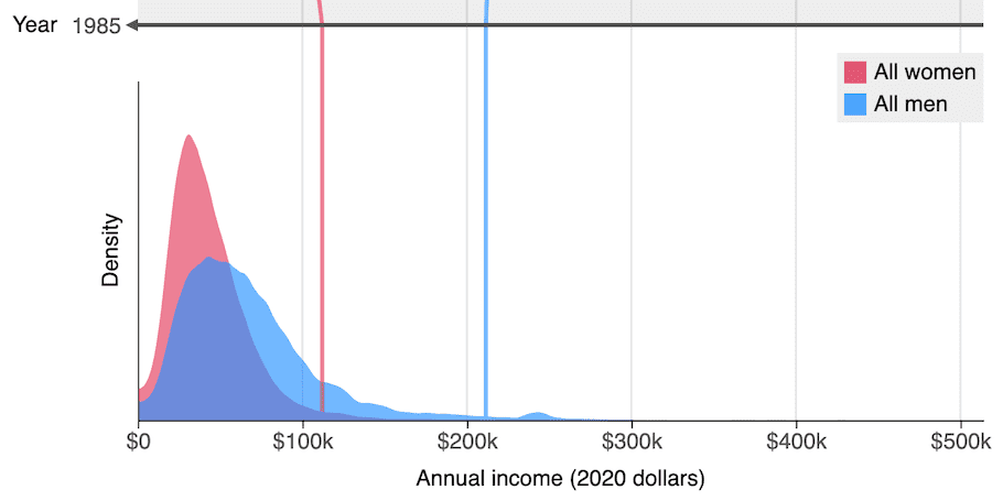
If you'd like to learn more, I've built two web apps that allow you
to compare Americans' income distributions using density plots.
In the first, income distributions are organized by generation and age,
and in the second, by demographics and year.
And lastly, you can sign up here
to be notified when I release new projects at electric scatter.